"I must leave now and...Never return!"
Bye Bye Year one blog.
Year Two
Tuesday 22 September 2009
Friday 11 September 2009
PR3: Process Recess 3: The Hallowed Seal
So a new book came into Ok comics the other day and I was pondering through it while sleeving up new comics. It's pretty far from a comic book but as a piece of art work, it's a stunning book: PR3 By James Jean.
Details:
248 4C pages
6 " x 9 " HC
$34.95 US funds (Got it for £20 because I work in the shop. British retail is £30.)
ISBN 978-1-935233-03-9


Well worth the buy I thought and very summer project-ish.
Details:
248 4C pages
6 " x 9 " HC
$34.95 US funds (Got it for £20 because I work in the shop. British retail is £30.)
ISBN 978-1-935233-03-9


Well worth the buy I thought and very summer project-ish.
Wednesday 2 September 2009
Polaroid
This is one of the pages in my Summer Journal, and yes it's about my cats. Sorry. Crazy cat lady.
First off, let me tell you of my idiocity in making this page. I'm sat there with Photoshop opened, frustrated that I couldn't make these fake polaroids look as if they where on a wall in a bed room somewhere.
....After several hours of terrible outcomes I was struck by lightning. Or something painfully similar. I printed out the polaroid's, stuck them on the wall with the printed text and took a photo. TADA! the effect I wanted to achive in the first place.

Looks good prtined out as well...If I do say so my self.
The kid is my sister.
Thursday 20 August 2009
Taxonomy
Taxonomy is the practice and science of classification.
"Taxonomy is a method of organizing content. For example classifying music by genre could generate this list: classical, jazz, rock. A single area such as "classical" might be further classified as concertos, sonatas, symphonies, and so on."
So what happens when I do it with Type that I find around my house? Comic, book, packaging. Can I get even further by grouping all of the single letter's together so I have page Of G's and E's. (Or in my case X's by the look of it...whoops.)
Do I only have to photograph the type, can I draw it myself and have page coloured with pencils, another only out lined?
I've really been getting into type and logo of late. Racking my brain's to come up with a decent logo for my own uses proved difficult. I kept staring at the piece of paper and the lettering that had no connection with the actual theme. It's time consuming, but it's great having other inspirations around me. It also shows the field I want to go into to, the sort of Graphic Design I want to reach towards.
It might work, it might not but that's the whole point of "trying".
As well as the logo/type book I've been making my own record of summer through image and illustration, including some type. Picture's too come.
Monday 10 August 2009


Thursday 6 August 2009
Oh The Perks...
....Of working in a comic book shop.
I think I died along the way to Leeds...really...
Books leant to me by the guys at work: (...I really do think I died somewhere. Don't resuscitate me.)


- Defoe 1666
- Scott Pilgrims Precious Little Life (just finished it...pretty amusing)
- Planetary
- Mesmo Delivery
- All Star Superman Volume 1 (Why yes....DC...it looks very lonely in my room)
- Batman: The dark knight returns (look SM's got a friend...)
- "Hey, wait..."
- Scalped
- The league of extraordinary gentleman, century 1910
- Trip Wire
Spent like an hour sleeving up the new releases...I'm pretty sure there were at least a 100 Buffy issues (pff, I took a wee bit longer than I should have and read a few of the new releases. Who wouldn't?)
Then I helped Oliver with the pre-order stuff that needed to be taken to the post office, which is now my job. =3
And the last hour was spent pottering around the shop reading everything on sight.
Over all. YES!
It's made me realise that I don't know as much about comics as I first thought I did. Eleven or so years doesn't seem so much when you nail it down to what I primarily read e.g X-men, DW ect. I've never really given other book's a chance. So now I'll get too.
And I read Deadpool before my boyfriend. *smug*
Ive also just been told by my friend Karl that if I don't read strangers in paradise he'll never fogive me...so that's another one added to the list.
Thankyou to Luke for the heads up that they where advertising for help. =3 I owe him!
I think I died along the way to Leeds...really...
Books leant to me by the guys at work: (...I really do think I died somewhere. Don't resuscitate me.)


- Scott Pilgrims Precious Little Life (just finished it...pretty amusing)
- Planetary
- Mesmo Delivery
- All Star Superman Volume 1 (Why yes....DC...it looks very lonely in my room)
- Batman: The dark knight returns (look SM's got a friend...)
- "Hey, wait..."
- Scalped
- The league of extraordinary gentleman, century 1910
- Trip Wire
Spent like an hour sleeving up the new releases...I'm pretty sure there were at least a 100 Buffy issues (pff, I took a wee bit longer than I should have and read a few of the new releases. Who wouldn't?)
Then I helped Oliver with the pre-order stuff that needed to be taken to the post office, which is now my job. =3
And the last hour was spent pottering around the shop reading everything on sight.
Over all. YES!
It's made me realise that I don't know as much about comics as I first thought I did. Eleven or so years doesn't seem so much when you nail it down to what I primarily read e.g X-men, DW ect. I've never really given other book's a chance. So now I'll get too.
And I read Deadpool before my boyfriend. *smug*
Ive also just been told by my friend Karl that if I don't read strangers in paradise he'll never fogive me...so that's another one added to the list.
Thankyou to Luke for the heads up that they where advertising for help. =3 I owe him!
Terrible Yellow Eyes
For all those "Where the wild things are" fans out there. (and I know your there.)
Found this cool little blog showcasing a collection of works inspired by the beloved classic, Where the Wild Things Are by Maurice Sendak.
Here are some of my favourite piece from the site:


Akk, there's too many too chose from but seriously, check 'em out.
Found this cool little blog showcasing a collection of works inspired by the beloved classic, Where the Wild Things Are by Maurice Sendak.
Here are some of my favourite piece from the site:


Akk, there's too many too chose from but seriously, check 'em out.
Monday 3 August 2009
Oh Facebook
So I was flicking past on the old FB when Craig posted a link to Ollie. Being an inquisitive type, I clicked on the link which took me to this rather amusing little article: Where Photography meets illustration.


(Look....no face brought you a present...)
They are awesome! I love the way that some of them don't even look like illustrations, but part of the photograph it's self.
The Artists name is Dmitry Maksimov, a Russian Graphic Designer. I also stumbled upon his Live Journal full of more ace little wonders.
A one up on the Beef Jerky Business Cards I think....Biscuit train tickets! (My high school Russian is limited...)


Not sure whether this is classed as design for print, or not. Oh well...I wouldn't mind the train so much if they where giving out free biscuits.
Saturday 25 July 2009
Summer Project: AWAY!
I now think it's time to really buckle down and work on my Summer Project. (Not that I haven't been doing so but sorting out the house and work kind of came top priority for a few weeks.)
I've decided not to move blog's but just to stick to this one. It'll be good to show my progress and means I won't have to fiddle around with unnecessary changes with other websites that I have linked too.
After finding last years summer project I was over all appalled at myself and so this year I am going to try and up my quilty and quantity of work. So far there isn't so much of a subject...other than the going on's and the random stuff that's happened over the last few weeks. It's probbaly going to be in journal form using illustration but I'll decide more about that on Monday.
I'll be sort of putting everything else on pause for a few weeks to make a good dent on work I need to do and what I want to achieve.
But I'm looking forward to it and to year two. Bring it on!
Greetings! Hope everyone out there is a having a decent summer despite the erratic change in weather. Before I do a summer project post, I wanted to share this Graphic Designer with you all.
Florian Nicolle
He's a 22 year old Designer and illustration from France and at first I was only aware of his Illustration stuff:


Florian Nicolle
He's a 22 year old Designer and illustration from France and at first I was only aware of his Illustration stuff:


I think what's drawn me towards his stuff is what draws me towards Skottie Young. The sketchy, un controlled way they both ink their pieces. But I'd check out his design stuff too. ^^
Thursday 4 June 2009
We Were Once Many
David Charles Haller (Legion), Professor X's very estranged and bizare son. (With his wild and crazy purple hair I wanted as a kid)


In lue of his upcoming magical coming back to life in New Mutants #1 that I got my hands on yesterday. #2 comes out today but I won't be able to get that till next week. Not that it's David speaking but...let's see what the writers do this time.
His left eye is green while the right eye is blue. (But I flipped the image after painting it -.-)
Legion quest 2 came out in '95, 3 years before I started collecting comics. But once I got my grubby 9 year old hands on it, he steadily became one of my favourite X-men. =3 Ahhh Nostalgia.
Legion (c) Marvel Comics
Edit: Why does my header keep going missing?
Saturday 30 May 2009
Where It's At...
All OUG103 (Design Practice) work is on my DP blog: http://designpracticeofleigh.blogspot.com/
This include type and Grid.
PPD work in on this blog.
Edit: Apparently my PPD stuff is on both blogs. Sorry.
This include type and Grid.
PPD work in on this blog.
Edit: Apparently my PPD stuff is on both blogs. Sorry.
Tuesday 19 May 2009
Portfolio/Presentation
Somewhere in this mass confusion of life and kittens, I've found a little bit of time to slave over this digital portfolio. It's been sort of hard for me because I have a tendency to look back at my old work and really dislike it. However, I've decide to push myself and the following are some of the piece I've chosen so far. It's not everything yet, there is some stuff I need to re shoot or re print out (cats like to sit on degree work and crumple it, who knew.) :

Mailshot: No news is good news part 2
The first part of this brief was to do make three posters on a subject chosen from the Guardian Newspaper. I chose the train fair article as it was quite appropriate to me. However, I really disliked the final results for them but I persevered with the mail shots that where of the same subject and tried my best to keep it simple but affective. (By the way, I burned the guardian posters....)

Visualisation and Ilustration Elective Final
For my illustration elective back in February we had to pitch a movie (existing or fabricated) in anyway we saw fit. I have a guilt pleasure for classic litrature and Nicholas Nickelby is one of my favourite novels. I chose to illustrate one of my favourite scenes but I wish I had been able to do more scene. Maybe when I concour Time.

How To...
Possibly the best thing I've done to date is the "How To" breif? I'm not sure if everyone else will agree but I liked how I was able to approach this brief in several differnt ways. In the end I went for satire in book form and the people who have seen this really got a kick out of it. I now wish I had done more pages to make the book a little thicker.

Adam's Font: A typeface for Adam Townend
Adams Font. This was a difficlut brief for me to wrap my head around until it clicked with me and I simply got on with it. It's certainly more affective than the original letters that I had in mind for Adam which where : Spooky looking and very unlike Adam. After that little insight I spent the following weekend re inventing the work I had already done and shifting it a new direction.

Convince/Persuade us
Group work from the begining of the year. I wanted to include this to show how far I (and the rest of the class) have come int erms of what it is to be a designer. We all thought these where really well done (or atleast I did) and our letter was voted as the best so we must have been doing somthing good. I'm now not as over whelmed with group work, as we're all in same boat. (more or less)
To Be Included:
- Colab Work (DS Books)
- Book Of 100: The Marvel Superhero Handbook
- What is A line
- Red: Series Of Ten (Red Characters)
- Pure Poster
Tuesday 12 May 2009
Mini Manifesto
This is my 5 point mini manifesto as discussed in a PPD session.
What I want to be as a designer;
What I used to be as a designer:
Terrible if I’m being brutally honest. I had no sense of direction and everything tended to look one big unfocused mess. I would close off my ears and refuse to listen to good critique because I believed people did not “get where I was coming from.” I thought I had graphic design down but if that were the case then I would not be on the course.
However, when looking back at my work a week or even a month later, all the flaws would start to shine through. I see the mistakes in my work but most of the time, it’s too late to fix.
What I am now:
There is this little box I have called “Leigh’s safe place” where the harsh world of graphic design can’t et me. I need to move out of this comfort zone but so far I seem to be taking never-ending baby steps. When looking at my work, I still feel very insecure about showing it. Sticking it up on a website or a blog is no problem but standing there in the room with it with others makes me see it as the audience. Sometime this can be a great way of critiquing yourself. However, I see it as not yet worthy and it frustrates me when people don’t see it the way I do.
Three things I want to become:
- Better at having more pride in my own work. Not to an egotistical extent but to be able to look at something I have achieved and made and to be able to say I did a good job about it. Not to dwell so much if one person out of fifteen don’t like it because I can’t please every one.
- To realise that I’m not always going to be designing for myself. Of course you can have a little bit of your own personality in your work, but so much that it dominates the piece.
- Taking in good criticism and using it for my own advantage. If it’s being given to me then I should use and not brood on the fact that not everybody “liked it.”
Tuesday 5 May 2009
Illustrators
I need to start practasing my anatomey and general illustraion skills some more. But ere's some work I really apprecaite. (Though will never achieve)
http://danielauhlig.blogspot.com/ : Daniela Uhlig


http://danielauhlig.blogspot.com/ : Daniela Uhlig


http://tjandamal.com/ (she doesn't give her name on anything, but i know she's a graphic designer from Texas. ='D ) http://bigbigtruck.deviantart.com/ :


Tuesday 28 April 2009
Cocept Proposal: The Newbies!
What is the problem?
The the first years come into all this sudden money that they have not bee used to before. Silly spending ensues on non essential goods and their food budget is cut considerably. Up until the next Loan installment, not everyone has enough money to eat.
What are you going to do about it? (identify, inform, promote)
I intend to Promote a ration box for the 1st years that they can use in case of emergency's.
How are you going to do it?
By researching various existing ration boxes from all kinds of backgrounds. Also looking into what cheap pre-packeaged food exists in the current market. (nothing that needs to be frozen or refridgerated.)
Saturday 25 April 2009
A Brief History of the Grid
From a natural point of view:


The Modulor is a scale of proportions devised by the French, Swiss born architect Le Corbusier (1887–1965).
From This:

(Leopoldo Metlicovitz, “Fleurs de Mousse,” 1914.
Advertising poster for French perfume.)
To This:

But this is al very well and said, but design with the grid system has come along way:
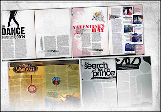
A more modern theme which would work better for craigs interview piece. Apart from the Warcraft spread, I think the other 2 work exceptionally well but i think the two black and white pieces work better.

Vitruvian Man; "The drawing is based on the correlations of ideal human proportions with geometry described by the ancient Roman architect Vitruvius in Book III of his treatise De Architectura. Vitruvius described the human figure as being the principal source of proportion among the Classical orders of architecture. Other artists had attempted to depict the concept, with less success. The drawing is traditionally named in honour of the architect."

The Modulor is a scale of proportions devised by the French, Swiss born architect Le Corbusier (1887–1965).
From This:

(Leopoldo Metlicovitz, “Fleurs de Mousse,” 1914.
Advertising poster for French perfume.)
To This:

But this is al very well and said, but design with the grid system has come along way:

A more modern theme which would work better for craigs interview piece. Apart from the Warcraft spread, I think the other 2 work exceptionally well but i think the two black and white pieces work better.
Layout Brief: Craig Fawell
In the few weeks leading up to Easter break, we've been having type and grid workshops. These have been very insightful and I've now realised that I have only just begun to scratch the surface when it comes to these kinds of layouts.
Now all of this knowledge I have gained on the anatomy of typefaces and the correct way to measure grids and columns has to be presented in an article based on a fellow designer. I was paired up with Craig who I have rarely spoken to since Septmeber. I took this as a good thing because I'm not very good at mixing with people. It was insightful because I had judged him wrong in the begining. I believd him to be one of these "football" types but as it turns out he doens't have that much interest in the sport.
He comes from a small village just out side of Leeds and enjoys going to the gym on his days off. A really nice guywho presented himself to be very calm, pleasent and insighful. He enjoys contempory Graphic Design and belives that such design should have meaning. He's not just about making somthing pretty of preseting facts and Figure. An opinion man at heart, he wants to get out there and shout it to the world! (In the form of Graphic Design ofcourse)
The interview I did with Craig went faily well and I am now to design threes dps' (double page spreads). One of these has to be an introduction piece of around 500 words. Next will be the mian body of 1, 500 worlds and the last will also have 1, 500. It's allot of words for a person i've spoken to about 3 times but luckily I'm good at making things stretch. (Besides...we can copy pasta.)
The tag line needs some work but I was thinking: "Facts and Figures are for calculators. Show me the opinion and I'll show you Graphic Design." .... It needs work.
Friday 3 April 2009
Too True...

I couldn't have put it better myself Jamie.... No really I couldn't.
But all humour a side, there's a few artist I want to feature and have a small rabble about their work. The first Is this guy: Michael Choi

A superb Marvel artist who, in my opinion, draws the prettiest looking X-men ever. I mean, this guy needs an award, he made Logan look man pretty. So far, thats a hard thing to do with a tiny hairy canadian man. He's working on the new and "messiah war" for Marvel and Oback is ging to go kick ass on his lines, her colours are almost painting like.
Allot of the time it's not the writer that can make the story work, art has a big hand in the deal. I'm currently feeling that way about a certain canceled story line. Maybe if the art was more tolerable...But then I realised; no. The story was terrible.

Mark Brooks is also another favourite of mine. There's just something animated about his works, if the budget was high enough then his art would make epic animation. I'm so looking forward to the new arc of Young Avengers, this time though it's dark reign. There is somthing almost Wither like about the guy in front, something I pointed out on the new line up. Maybe because Brooks did the New X-men artwork...maybe I just want Wither back.
(More later when I'm not coughing my guts up from a chest infection.)
Wednesday 1 April 2009
End Of Module: Self Evaluation
OUGD 104
Visual Language/What is A line
Self Evaluation:
I belive I struggled a little at the begining of the "What is a line" project as I was conffused as to what I should be doing. This was my own fault for not asking questions and simply thinking It would be allright and maybe someone else would bring the point up. I was grasping at straws on what to do and kept putting off the work. Because of this my work suffered and I have not produced enough work for 4 months.
Luckily In the last few weeks I bucked my act up and got my ideas together and have produced somthing I am fairly proud of. I wish I had made the decision weeks ago to make the poster/book so I could have a series on them. It was either make one or a set. Having just two of three would look bad. This also gave me a chance to make an initial mock up of what I was going to make.
The crits helped me to an extent because I am still stuck in a stubbon mindset that I don't really need to listen to anybody elses opinion. I do take things that people have suggested on board but I don't always include this in my documentation or even my work itself.
Even though I have a final resolution, I belive there is not enough delelopment work to back up my initial ideas. I felt that the other briefs were more of a priority, and because it was a long project I thought I had time to do it, which is really not the case. I should of taken time out more regularly work on this project.
I already knew about perspective drawing from various art classes over the years, but it's always good to go back over things that I have forgotten about. Also, I can now apply these perspective grids to basic letter forms and shapes.
I have also learnt differnt ways to represent what I think with quick exercises. For example, making animals from basic shapes and various letterform with limited stock. Some of these where really affective and I think they stand out more than if I had drawn them with a pen/pencil.
Visual Language/What is A line
Self Evaluation:
I belive I struggled a little at the begining of the "What is a line" project as I was conffused as to what I should be doing. This was my own fault for not asking questions and simply thinking It would be allright and maybe someone else would bring the point up. I was grasping at straws on what to do and kept putting off the work. Because of this my work suffered and I have not produced enough work for 4 months.
Luckily In the last few weeks I bucked my act up and got my ideas together and have produced somthing I am fairly proud of. I wish I had made the decision weeks ago to make the poster/book so I could have a series on them. It was either make one or a set. Having just two of three would look bad. This also gave me a chance to make an initial mock up of what I was going to make.
The crits helped me to an extent because I am still stuck in a stubbon mindset that I don't really need to listen to anybody elses opinion. I do take things that people have suggested on board but I don't always include this in my documentation or even my work itself.
Even though I have a final resolution, I belive there is not enough delelopment work to back up my initial ideas. I felt that the other briefs were more of a priority, and because it was a long project I thought I had time to do it, which is really not the case. I should of taken time out more regularly work on this project.
What skills have you developed through this module and how effectively do you think you have applied them?
I already knew about perspective drawing from various art classes over the years, but it's always good to go back over things that I have forgotten about. Also, I can now apply these perspective grids to basic letter forms and shapes.
In this module I have also been able to improve on my drawing skills. As illustration/technical drawing is something I really hope to improve it has been a really good opportunity to practice. I know feel allot more confident about quick exercises like pictorgrams.
I have also learnt differnt ways to represent what I think with quick exercises. For example, making animals from basic shapes and various letterform with limited stock. Some of these where really affective and I think they stand out more than if I had drawn them with a pen/pencil.
I feel that my photography has also improved as now I'm more confident in technical knowledge than I was before. I still have not quite figured out all of the settings but it is somthing I am slowly working on. I am using my own camera as much as I can to document what I am learn and these can been seen through out my blog.
What approaches to/methods of reserach have you developed and how have the informed your design development process.
Through out this module I have researched spersific things for my "What Is A Line" project by the typical use of the internet but also by using my own family files. I have learnt not to rely souly upon the internt and have also checked books out on techincal drawing and perspective.
What strengths can you identify in your work and how have/will you capitalise on these?
I have kept an ongoing documentation of this module on my blog and have documented what I have learnt/created. This has helped me to manage this project more and has further reinforced certain rules I have created for my self.
I also feel that my initial making skills have come along in these last few months and the final piece for my "What Is A Line" is a fairly strong piece of design.
What weaknesses can you identify in your work and how will you address these more fully?
It is not nessisaraly time management that I have a problem with but my inability to look at things and go: Right, I need to be doing this now! I plan on writting more To Do lists and to ban my self from certain things like the computer/my books/comics untill I have done a suficient amount of work on the module. This way I will not be rushing on hand in day to get everything up to scratch.
I have change my initial idea more times than I really needed to. At one point I was in two minds over which way I was going to take this project and becasue of it, there does not seem to be enough work for the spercific topic I have chosen. If I had stuck to my original idea/thought of the final one nearer the begining then I would have more deleopment work.
I need to loosen up when it comes to my drawing. In the lessons with Lorenzo I wa so busy trying to make them look decent that I did not do as much as I should. It was supposed to be about the ideas and not the actual craftman ship of the drawings. I need to learn to work more freely but to also keep it neat. Currently it is somthing I am working on in all aspects of my work whether is is for Graphics or my own work.
Identify five things that you will do differently next time and what do you expect to gain from doing these?
1. Decide on what I am going to do fairly quickly. To not dwindle on several possible ideas that are not going to work/go anywhere.
2. To have more worksheets and to document evreything inside a note book.
3. To think of the audeince and context before I start on a project. This way I will not be grasping at straws for what to do.
4. Keep my worksheets and all work neater. I have an tendencey to let things get ruined and so I have to re make them.
5. To not worry about making somthing look neat, but to simply get on with the idea at hand. I can always come back and work on it later if I do not think it is up to scratch.
How would you grade yourself on the following areas:
5= exellent, 4= very good, 3= good, 2= average, 1= poor
Attendance: 3
Punctuality: 4
Motivation: 3
Commitment: 3
Quantity of work produced: 2
Quality of work produced: 3
Contribution to the group: 3
Sunday 22 March 2009
100 Things To Draw Challenge
I set myself a challenge last year to draw at least a 100 things with separate themes. I failed miserably and only did 3 out of a 100 and they where crudely done.
So I'm going to try and do it again, and I'm going to set up a new blog for it. (They'll look really bad and will clog up my Deviatnart art if I put them all on there.) It will also be good for geting me to draw more. I tend to go through phases of what I want to do. (read, draw, write). I once didn't draw for three months and it made me rusty.
(will link the new blog here in a bit)
Tuesday 17 March 2009
Some Great Work...
Some pieces of art and graphics I've stumbled across of late.
All art can be found over at Devaintart.com

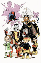
First and for most, one of my favorite comic book artists: Skottie Young. His style never ceases to amaze and amuse me. Marvel is doing a series of Wolverine covers done by different artist drawing in the style of old school artists, he picked Edward Gorey. (Another great and differnt artist)
Skottie Young

Some likes Pocky a little too much I think. I can really see the style all the way through this design. However, it's adorable and a part of me still knows it's female and I have to grin at grahics like this.
designslave.deviantart.com

I live near this guy, it was quite peculair to find him over on DA. We where making CVs last year in my ND class and I was over whelmed by this design which he knocked in no amount of time. He's got a a real eye for design and I actually see him being big in the world of Graphic Design.
weyforth.deviantart.com

And because I like the look of good logos that work well. Besides, i like the colour scheme.
schakalwal.deviantart.com
All art can be found over at Devaintart.com

First and for most, one of my favorite comic book artists: Skottie Young. His style never ceases to amaze and amuse me. Marvel is doing a series of Wolverine covers done by different artist drawing in the style of old school artists, he picked Edward Gorey. (Another great and differnt artist)
Skottie Young

Some likes Pocky a little too much I think. I can really see the style all the way through this design. However, it's adorable and a part of me still knows it's female and I have to grin at grahics like this.
designslave.deviantart.com


I live near this guy, it was quite peculair to find him over on DA. We where making CVs last year in my ND class and I was over whelmed by this design which he knocked in no amount of time. He's got a a real eye for design and I actually see him being big in the world of Graphic Design.
weyforth.deviantart.com

And because I like the look of good logos that work well. Besides, i like the colour scheme.
schakalwal.deviantart.com
Subscribe to:
Posts (Atom)